Category Archives: The Writing Life

The Write Illustrator

Artist, Jennifer Miller

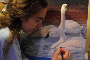
Guest Post by Jennifer Miller

I want to thank Joshua Essoe for inviting me to write an entry today! I’m going to talk with you about visual artwork for your book-for most, this means cover art. Unlike many bloggers here, I am a visual artist, and not an artist with words, so if you make it to the end, pat yourself on the back.

Before I begin, I wish to make clear that I am going to focus on those writers that intend to self-publish, or publish with smaller independent publishers. Large publishers tend to have their own artists that they work with; sometimes the author has little say in who illustrates their cover. Exceptions to this might be illustrated children’s books and things like graphic novels, that have a lot of art on each page. That is a subject for another post entirely. Pressing on….

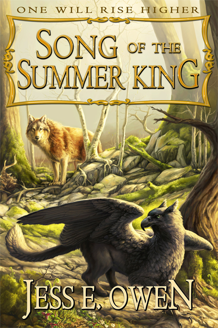
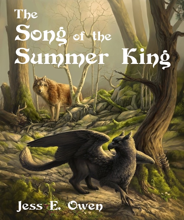
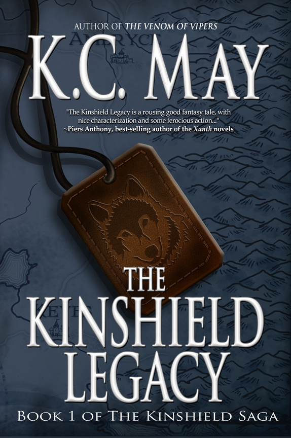
You have a great story. You stand behind it, and you are ready to publish. Time to slap some art on that thang and call it done! The theory is simple; you want something that instantly tells the reader something about your book… perhaps a mood, or a key scene, or even just a mysterious glimpse to grab their attention. The cover is your product packaging, so some care must be considered beyond “put a nice picture on there.”

Okay, so you knew this was coming: “You can’t judge a book by it’s cover.” This is, of course, true about the story, but it is hardly a good reason to dismiss the cover. While I am admittedly biased, I am sure that if you asked around, I am far from alone: people notice the cover. The book is not defined solely by its cover, but certainly a cover can greatly influence who notices your book, how many people notice it, and why they notice it.

Check out this quote: “The cover may very well be the single biggest piece of marketing that book will receive,” says Paul Buckley, the Vice President Executive Creative Director at Penguin Group USA. “For first time authors and writers that have not yet built up a big following, the cover may be the only thing that gets a reader (or reviewer, for that matter) to physically pick the book up.” (source below)

While e-books have started to pick up steam, both book types benefit from having eye-catching art on the front. In fact, some suggest that e-book covers are just as important than those on physical books, because online buyers are presented with a myriad of thumbnail images when browsing on the most popular sites. The most eye-catching images in the thumbnail soup can have a big impact on what pages readers open up to further investigate. In the physical world, I cannot begin to count the number of times I have picked up a book based on the subject matter on the cover. Whether I was delighted or disappointed with the contents of the book is beside the point–the cover got it in my hands and got my eyes reading that wonderful text inside….

For much more reading on the importance of covers, check out this article.

Well, you’ve decided you want a cover, and you have the freedom to select the artist you want. Where to begin? Some of you might have an artist in mind for years, or some of you might have no idea. One way to start out is to consider your genre and begin your search that way. There are many websites out there; some are direct galleries on personal artist websites, and some are a huge mosh pit of everything. Browsing and searching might take some time, so kick back and enjoy the visual roller coaster.

Jennifer Miller's artwork for Song of the Summer King by Jess Owen.
Jennifer Miller’s artwork for Song of the Summer King by Jess Owen.

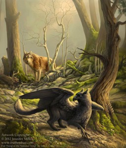
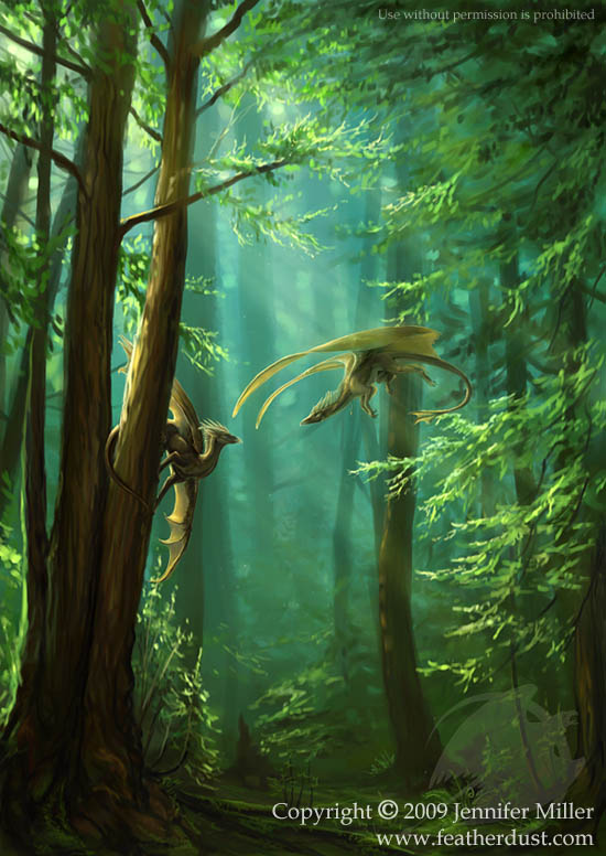
Once you find someone that tickles your fancy, pay close attention to their subject matter and style, and imagine that style on your cover. Visualize what subject matter you want–is it radically different from anything the artist has in their gallery? One thing that surprises me as an artist is that sometimes I will have someone in love with my style, but pays no attention to my subject matter… or, someone that is in love with my subject matter, and pays no attention to style. By all means, artists do branch out, and it never hurts to ask! But… do not be surprised if the photo-realistic artist is not keen to paint an anime-style cover for you, or if the artist that paints landscapes says ‘no’ to your cyber-punk cover. You may be pleasantly surprised, of course, but observing the artist’s strengths can only help you find someone that will mesh well with your project!

Another important consideration is time. For some artists, rolling out a complete painting in a short period of time is no big deal, and some people do work better under stress. For most artists though, we have a great many projects that have deadlines throughout the year. Asking for a fully detailed cover painting just days before you hope to publish is a good way to get a “sorry, I cannot…” letter in return, or… at the very least, some pretty stiff “rush fees” to cover the all-nighters that such a project entails. Different artists can work at different speeds, but a really nicely-detailed piece can take me more than one hundred hours. This is not counting the investment of time in research, and communication to make sure everything is on track. It is not unreasonable to consider contacting your potential artist at least six months before you have a deadline; some high-profile artists might need more advance warning than that.

Cost is something I am only going to touch on lightly because, frankly, this is a wild variable. I like to think that artists and writers have a sort of brotherhood (I think of it as the Brotherhood/Sisterhood of Underpaid Creative Persons). We both know what it is to do something you love and probably not get paid much for it. We both know what it’s like to be self-employed, and how much of our money just flies right out the window to the tax man and bill collector. Just as you would hope that someone would be willing to pay fairly for your time, please consider paying an artist fairly for theirs. I have found that most writers are amazingly cool about this (go, Brotherhood!), but I have had a fair number of rude individuals that tried to convince me that my time and skills were worth nothing. There is an artist out there that will work for any cover budget you have, but you will probably get what you pay for. Investing in a good cover is one of the most important investments you place in your book. However, don’t be deterred if you can’t afford much. Look for artists whose work is simple and has less time invested. If your artist has any sort of following, consider the amount of traffic simply having them do the cover might bring you. Once they have art published on your book, they have an investment in your book now too.

Rights and contracts: this is something that a lot of authors don’t consider until their artist is asking, “What rights do you need to buy?”

Our Forests - Digital.jpg by Jennifer Miller
Our Forests – Digital.jpg
by Jennifer Miller

Uh, what? Now, I am not a lawyer, nor do I play one on the internet, but this is always, always, always the time for contacts. It doesn’t matter if it’s your best friend, or your sister’s boss, or your grandma. Get a contract written. Be clear what is expected from the start, and who gets what rights, and what those rights cost. This can, and has, saved many a proverbial rear-end in the past. Authors don’t often think, “Well, this one will end up on the bestseller list, and get turned into eighteen movies, and will sell millions of action figures, and t-shirts at Hot Topic.” But… sometimes, just sometimes, this actually happens. Research some the high-grossing current authors and you will soon realize that they rarely knew something was going to make it big. Knowing who owns the art for what purposes is a big deal when this sort of thing happens, and the only thing worse than being enemies with your artist is fighting each other in court. Don’t do this. Be friends, and write contracts. If you need help with this, there are a lot of websites out there than can help you, and some even provide contract templates. When in doubt, ask a copyright lawyer.

Communication is always important. This is where an artist-writer relationship can be made or broken. Of course, be polite for goodness’ sakes… but don’t waffle. Be clear about your expectations from the start, what you want, when you want it, and if you want fries with that. Expect your artist to do the same; if you need to, ask them to please describe the process so you know what to expect. Don’t be afraid to ask questions, and remember that even if you have a very clear mental image of the artwork, the artist cannot read your mind. You are a writer, by George! Use your words to paint them a picture so they can paint you something you are pleased with.

When author and artist really mesh and have a good time with the process, it is a beautiful thing. Mutually helping one another through all parts of the process, and beyond, is part of the wonderful community building that bonds creative people together and keeps them from going completely off the deep end. We are the Brotherhood of Underpaid Creative Persons, darn it, so let’s make something wonderful together!

Jennifer Miller resides in NY state in a rural area, surrounded by parrots and chickens. She’s an award winning professional artist that specializes in fantasy and wildlife artworks. Her work is sported on the cover of several published fantasy novels, as well as children’s books and a few anthologies. In the past she has freelanced for Nickelodeon magazine and Baen publishing. You can find more about her and see her work at www.featherdust.com.


Typography: A Tale of Two Covers

Author, Jess Owen
Author, Jess Owen

A follow-up by Jess Owen to yesterday’s post on typography.

When I set out to self publish Song of the Summer King, I knew I wanted everything to look “traditional.” I wanted it to look polished and professional, like something put out by one of the Big Six. I invested in the artwork by hiring a freelance artist who’s well known for her fantasy, wild life and particularly gryphon artwork. I invested in an editor with a great track record who I believed understood my goals for the story. I had plans for a big Kickstarter fund raiser, and wanted to hire a printer instead of going POD.

With all that done, somehow, I still thought it was fine to slap some letters on the front in a free, “medieval-looking” font, and call it a day. Fortunately my friends had my back. Josh Essoe sent my cover art around for some critiques from some pros, and very honestly told me, “You’ve invested too much in this book not to get some professional lettering on the cover. Talk to Moses Siregar; he’s put the same kind of effort into his work.”

So thanks to the power of author friend networking, I contacted said successful self-publisher and he gave me the name of his typographer, Terry Roy. She seemed excited about the book, I liked her portfolio, and so she put together a package deal to not only do lettering on the front of the e-book and the hardback edition, but to handle the interior layout and format the books for printing and uploading to Amazon. And thank goodness she did.

I think sometimes we self-published authors think we have to do everything ourselves. But just as I would hire a professional to tune up my car, I now know the value of investing in professionals to wield their magic over my stories. It’s a matter of time, energy, and expertise.

I’m so happy with the final product and with the team that fell together to make it happen. I truly believe all writers need a master mind group to make their work really stand out, and I know for my book, I couldn’t have asked for more. Below you’ll find my cover before and after the professional typography and design.

AFTER
AFTER
BEFORE
BEFORE


Jess Owen has been creating works of fantasy art and fiction for over a decade, and founded her own publishing company, Five Elements Press, to publish her own works and someday, that of others. She’s a proud member of the Society of Children’s Book Writers and Illustrators and the Authors of the Flathead. She lives with her husband in the mountains of northwest Montana, which offer daily inspiration for creating worlds of wise, wild creatures, magic, and adventure. Jess can be contacted directly through her website, or the SOTSK facebook fan page.

Typography: It’s Not A Cover Without It

Illustrator & Typographer, Terry Roy

Guest Post by Terry Roy

Many authors go on the extravagant hunt for the best cover art out there. And while cover art is an important part of creating an attractive selling package (your book), bad typography can ruin it. Without typography, it’s not a book cover. It’s just a photo, an illustration, a painting.

What is typography? Glad you asked! It’s the art of arranging letters and words attractively on a page. Whether or not that page is a book cover or an interior narrative page, a billboard on a highway or stamped on a grocery bag you take home from the market. Most professional graphic designers are trained in this. Many others creating book covers nowadays are not. If you’re hiring someone to do a cover (to me, this means the complete package), or add typography to the image you want as the background for your cover, make sure you look at their portfolio and like what you see. Forget the pictures. Make sure you like what you see even if the titles and author names were on solid color backgrounds. Great typography design can carry itself, images added or not.

I can write pages and pages on this, but to keep it simple, I’ll distill it to basics.

1. When you commission artwork or start your image search, remember you need to display large, visible type on top of it.
Too many people sacrifice the visibility of the book title or author name so they don’t cover up the art. In my opinion–that priority should be the other way around. The art shouldn’t interfere with the stand-out impact of the author’s name and the title of the book.

2. The typeface you choose for the title can set the mood and tone of the book from the start. Choose wisely.
There’s a reason that many thrillers, spy stories, and suspense novels use a simple headline font like “Impact”—it denotes urgency, demands attention. Distressed or goth fonts get used on gritty, post-apocalyptic stories or dark vampire stories. (Be careful here, many distressed fonts won’t “pop” without a lot of help and unless you are a bestselling author, you don’t want your title blending in with the background art.) Fancy script fonts with lots of loops and swirls remind us of romantic invitations–so we see some of that on romance novels. These examples are generic. But please, don’t just pick a font because you think it’s cool. It has to match the story, and feel right with the title. Font sites often give you the option of typing in your title so you can preview it as you scroll through pages of choices. Just try it—see how it changes the mood and tone with each new look. (I spend hours trying fonts on titles, like some people try on clothes.)

Art & Design by Terry Roy
Art & Design by Terry Roy.

Make sure your font choice–or the font choice of your cover designer– is legal to use commercially.
Please respect fonts tagged “for personal or private use only” and do NOT use them on your book covers. Often fonts at free sites were created to emulate a copyrighted, restricted-use font face. It is NOT okay to use these fonts on your books or anything you put out for sale or download in a public marketplace. (“Bleeding Cowboy”, which I see on a lot of vampire or paranormal books, is a good example. Lots of people are using it, but unless they got a licensed copy, or written permission from the designer, they shouldn’t be.) Go to a site like Fontspace and use the “Commercial Use Friendly” filter in the search. That way, free fonts that are cool to use on book covers and other projects will show up, without tempting you with the Personal Use Only fonts.

3. Visibility and Readability.
Now that you have the right font for your genre and title, and another for your name (a simple, non-fancy font will do in most cases) the third important thing is to make sure it’s clear, sharp, and readable. Remember, in the online market for both e-books and paperbacks, the reader is either spotting you first in a tiny ad or a tiny thumbnail image in a New Releases list. Even if your cover art loses fidelity at thumbnail size, the title, at least (if not also the author name) should stand out sharp and clear. Color choice is important here. It’s hard to go wrong with the classic choice of black (offset by white), or white (offset by black) when you’re just not sure. No matter what color you choose, contrast with the background is paramount. There should be enough contrast to “pop” that title even in small sizes.

Now… go out there and practice! One final tip I’ll leave with you today: study the bestsellers of your genre from the big name publishers. If you are a do-it-yourselfer, copy one of these covers. Import it into your graphics program and make it a locked layer. On a layer on top of that, challenge yourself to duplicate layout of the title, authorname, and any other print. You don’t have to match the typeface exactly, just get one close enough. (In graphic design courses, students are often challenged to duplicate the layouts on ads and product packaging–it’s a great hands-on learning exercise.) Even if you don’t want to tackle your cover typography on your own, studying what’s hot from the big pubs in your genre can give you a better eye for getting quality work from the person you hire to do it for you.


Terry Roy has been drawing ever since her fat little fingers could hold a crayon. Digitally illustrating and designing beautiful books, inside and out, since 1998. Her experience in digital art started in 1992 when the first MS DOS version of Photoshop was released for Windows computers. She can now be found at TERyvisions, and her blogsite.

Maximizing the Potential of Your eBook

Guest Post by Natasha Fondren

The question I get asked most by my clients is this: “What else, other than the text, should I put in my book?”

POD books and eBooks can handle extra pages, images, color, fonts, and content without any cost (up to a certain point, and even with Kindle, it’s marginal). When you’re done writing your book, you want to add content that will first, sell your book, and second, sell your other books.

SELL THIS BOOK

In eBooks, the front matter serves only one purpose: to sell this book to your readers.

In bookstores, readers check out books in this order:

  1. They catch sight of the cover.
  2. They turn it over and read the back cover.
  3. They skim through the appropriate ad pages at the beginning.
  4. They turn to the first page of the text and read a bit.

With eBooks, it goes more like this:

  1. They catch sight of the cover on the website.
  2. They click on the title.
  3. They check out the average rating.
  4. They read the synopsis and maybe skim the reviews.
  5. They download a sample.

It’s important to note that once they download a sample, they haven’t yet bought it. You still have to sell your book with the sample: the first 10% of your book.

CONTENT OF THE SAMPLE

In a traditional book, the opening consists of ad pages, half-title page, title page, copyright page, list of other books by the author, dedication page, epigraph, table of contents, and sometimes acknowledgments.

In an eBook, we want to get rid of everything that doesn’t sell your book because it takes up space in that first 10% of your sample. First, the half-title page, a holdover from printing processes, is completely unnecessary.

The copyright page will not sell your book, nor will it magically prevent piracy. Send it to the back. The acknowledgments, likewise, should be sent to the back.

The list of other books by the author will only sell this book if you have a long list that proves you to be an author who’s had some practice at this. When in the front matter, this list does not sell those books; it only tells the prospective reader that you’ve some experience under your belt.

This list is better at the end, after they finish the book, when they’ll be looking for their next read. Probably they’ve already seen on the website that you’ve written other books, if you have.

The dedication? As interesting as it is to you, it should only stay up front if it’s truly going to hook the reader into buying your book.

The table of contents is accessed through a menu button, so it’s unnecessary to put it up front unless it sells your book, as is the case in nonfiction (telling the reader what is contained in the book) or in some fiction, where the chapter titles are so interesting that they hook the reader.

So what does that leave?

  1. Ad pages
  2. Title page
  3. Epigraph
  4. Text

Ad pages go first, and these should be an invitation to the reader. While you should take advantage of this opportunity, do not let the ad pages dominate your sample; you want to sell your book to readers, then give them enough of your content to hook them into your story.

There are several potential items that can go in your ad pages (I don’t advise using them all!):

  • Reviews: If you have some exceptional reviews from respectable sources, or some funny, tongue-in-cheek reviews, then put two or three at the beginning. More than that, and you’re crowding out your sample.
  • Synopsis: Reminding the readers what the book is about is not only a good sales tool, but it’s also one of the ways the human mind learns: big picture to little details. When readers sit down to a book, they want to know what it’s about. While this information may be on the website, they may look at the sample days or weeks later.
  • Excerpt: A short excerpt, maybe one or two paragraphs, can work really well. There is an art to selecting just the right paragraph or two–make sure to get lots of feedback from your friends!
  • Letter to reader: This is a bit of an old-fashioned technique that I’ve only seen in romance books. It’s been used quite a bit, so it must have some effect. If you pick this, please make sure your note to the reader is super good!

The title page sets the tone for the book, so embed a nice font and have a care for the design. The epigraph, as well, can set the tone for the book.

The text should be inviting: a nice chapter header, a dropcap, possibly some styling in the opening few words all help pull the reader into reading your text. Book design is important!

A PROBLEM WITH AUTO-CONVERSION

If you upload a Word document or use a converter to make a Kindle book, then when a reader opens your book, it will open to Chapter 1, skipping all front matter, ad pages, and even the prologue.

If you hire a professional, they’ll make sure your book opens where you want it to–except the cover. On Kindle, the book generally refuses to open to the cover, unfortunately. (Please do write them and complain, though! Maybe they’ll change it!)

THE BACK MATTER

From the very second your reader reads the last sentence of your book, you need to sell your next book, or your backlist.
The back matter can contain:

Thank You: First up, it’s nice to thank your readers. Make it short and sweet; this is not an about-the-author page. Perhaps a sentence or two informing about (and linking to) what you’ve got in the back matter for the reader. For example:

“Thank you for reading Great American Novel! I hope you enjoyed it. A list of my other books is on the next page, and then the first chapter of my upcoming novel, Pulitzer Prize Novel, to be released in the spring of 2014.”

Second, offer a link to a very simple html sign-up form for your newsletter. (You do have a newsletter list, right?) This should be simple and ugly, easy enough for e-ink browsers to handle, such as my newsletter (free book on Indie Book Production coming soon to all subscribers!). Please note that this doesn’t have to be your only newsletter sign-up page, but for this purpose, you should stick to a sign-up page that can be handled by the worst of browsers.

A List Of Your Other Books: This can go before or after the next section.

Your Next Book: Like the sample, this should be in three parts:

  1. An image of the cover.
  2. A quick synopsis or blurb of the book that hooks the reader.
  3. An excerpt–you can make this substantial, such as the complete first chapter or two.

Other Ideas: I’ve seen some authors put a miniature version of their website in the back, starting with a home page that links to each section of the content that follows. Remember, the page count is nearly limitless, so be creative and give to the reader, and hopefully they’ll give profits back to you!

AND THEN . . .

After that, you can put an about-the-author page, so they know who you are. And then, (finally!) all the stuff you took out of the front matter that doesn’t sell this book or your next book.

the eBook ArtisansNatasha Fondren is the founder of the eBook Artisans. Whether you’re a traditionally-published author looking to make an out-of-print book available, an indie author releasing a self-published eBook, or a publisher looking to make a backlist available, the eBook ArtisansSM is passionate about making your print book or eBook a welcoming and beautiful experience for your readers.